
Project duration: ~1.5 years
My role: Design Lead
Team: Forms, (Visitor Experience Group, Marketing Hub)
Team formation: 1 DL, 1 PD, 1 CD, 1 PM, 1 EL, 1 TL, 3 BE, 3 FE
Key strategic objective: “Make it easier for marketers to start and scale with us”
Priority: P0 (Highest priority)
Background
The HubSpot Forms tool had been – virtually – mostly unchanged for more than 10 years. It was no longer serving our customers well and customers looked to third party tools for the ease of use and sophistication we were lacking. I was brought in as Design Lead to lead the vision and execution of the reimagining of this tool.
Problem Space / Opportunity
Marketers rely on forms as one of their biggest levers for capturing the leads they need to grow their business. But the process for creating a well-branded, easy-to-use, high-conversion form has been a consistently painful experience. This has been reflected in our CSAT scores. In its previous state, Forms made it difficult and costly for customers to match forms to their company branding, to deliver a frictionless experience to visitors, or even just to get a functional form live on their site. This work was all about building an intuitive forms experience that unlocked the potential of HubSpot forms and made it easy for customers to build powerful, personalised forms that convert.
Even though customers had a lot of power at their fingertips already, we found that 55% of collected form submissions from HubSpot’s Free & Starter tiers actually come from non-HubSpot forms (Forms created on other platforms like WordPress, that are synchronised to the HubSpot CRM). They still relied on 3rd party tools for form creation, rather than switching to HubSpot. Prior to starting this work, over the previous four years we continued to get feedback that HubSpot forms can be difficult to create. The learning curve needed to master CRM ‘properties’ up front, before navigating a lengthy, complex editing process made it challenging for users to get started. Our research made it clear that in order for HubSpot to win in this segment, we needed to attract those Free & Starter tier users with ‘easy to use’ forms.
For Professional & Enterprise tier users, it’s the power of the platform that keeps them coming back. However, our existing offering lacked both table-stakes features, and the advanced options, like multi-step forms, conditional logic, or conversational forms, that customers and visitors expect from us. As well, we heard too often that our customisation options were basic. Marketers have to labor tirelessly on the styling of their forms. And despite those efforts, their website visitors could still spot a HubSpot form immediately because it looked more like our brand than our customers’. All these feature gaps placed us behind our competitors: TypeForm, Jotform, and Google Forms.
Reimagining the HubSpot Forms experience gave us a chance to create an offering that resolved long-standing customer pain and empowered them to build high-conversion forms that are easy to learn, easy to use, and easy to love. To achieve this, the redesign focused on usability, scalability, and sophistication. We took a step back to think about forms from first principles, and used a round of research and discovery to build our ‘North Star’ vision. We overhauled the editor UX and information architecture, simplified the creation and publishing flow, and equipped marketers to embed their forms wherever they need them. Marketers get more control over customization and styling, reducing their need for developers.
Finally, we’ll did all this work through the lens of improving the connections between Forms and the rest of the HubSpot platform. We looked at opportunities to improve the quality of data that our forms are feeding into the CRM, as well as how they could take advantage of that data to deliver a more targeted and personalised visitor experience. We also carefully considered all of the places across the platform where Marketers were creating and using their forms – including HubSpot CTAs (Pop-ups), CMS (Website pages), Blog, Ads, Meetings, Chat, and more. Through partnership and collaboration with other product teams, we crafted a better Forms platform experience that made sure all our customers use cases for forms could leverage the power of Forms 2.0.

Research
A lot of research had been done over the previous number of years, plus there was a ton of product and historical context already in the team, so we did not feel that we needed to start from scratch with research upfront.
Despite that, one of the things I noticed when I joined the project was that some misalignment existed in terms of expectations about the project, what we’re building and for who. I facilitated an ‘Assumptions Mapping’ workshop exercise for the team to note down their expectations, what they think we’re building, fears/risks, and rank each of these in terms of priority. Following this exercise, it became apparent that there some knowledge gaps and a need for a research review ‘digest’ activity. As part of this activity the group would review existing research in some detail and have a number of fast-follow readout and discussion activities to support team alignment. We included a wide range of research artefacts in this review:
- CSAT
- Customer Roadblocks (we get this information from our Product Experts)
- Competitor analysis
- Customer interviews
- Usability audits of the current tool
- Customer profile/personas
- Engineering audits of the current platform’s scalability
- Usage trends of the tool over time
- and more.
The outcome of this exercise was team alignment about what we’re working towards building.
Developing a Vision
It was my responsibility to drive and produce the team’s project or North Star vision, creating an artefact that could be socialised and presented to our stakeholders.
Taking all of the research context, customer data, personal experience, stakeholder interviews I conducted and engineering input I received on the scalability of the current platform, I developed a North Star vision artefact (slide deck).
This vision included the recommendations:
- Improve usability of the editor across the board. Use Usability grading studies to measure baseline performance of the previous forms tool and compare that to measurements taken quarterly from users using the new forms tool.
- Meet the table stakes that our customers expect from a Form builder in 2024, and surpass our competitors in terms of features like ‘multi-step’ forms
- Ensure that HubSpot forms no longer ‘stick out’ on our customers websites, or are recognisable. We do this by dramatically expanding the styling capabilities of the new tool to support customers building forms that better match their brand characteristics.
- Until now, customers needed to use different form types depending on the channels they wished to use them in. E.g.: website-embedded forms, pop-up forms etc. What could happen was a customer might choose one form type, create their form, only at the end to realise they needed a different form type, but it wasn’t possible to change that. My vision was to reduce this complexity down to one form that was scalable and versatile enough to be used anywhere. We don’t want customers to need to worry about choosing the right form type.
- Set out a number of design principles to guide us through difficult trade-offs during the course of the project
- Develop 3 personas to help us scope and prioritise what we want to deliver, for who.
This process took around 4 weeks. Developing the vision was a collaborative process, where I brought in relevant colleagues who had different perspectives or subject matter experts to contribute. Drafts of the vision deck were shared with select stakeholders for feedback during this process.
Once the vision was completed, I presented the slides to HubSpot UX and product leadership, soliciting feedback before we moved to the next phase.

Challenges
We knew we had a number of hurdles to overcome when it came to releasing a best-in-class forms tool:
- How do we reconcile the business need to integrate our CRM (and it’s associated concepts) with our new easy to use Form tool? This makes us unlike competitors in that there’s an extra step involved to connect the form to the CRM, but it also acts as a unique value proposition for us.
- How can we integrate emerging AI technology into our tool where it makes the most sense and has the most value to customers?
- Our legacy tool is not scalable enough on both the platform side and the user interface to allow us to make the improvements that we need. How do we navigate this; do we re-platform? do we throw out all of the old user interface (and patterns that customers have learned to use) for something totally new?
Process and Structure
To set the team up for success, we implemented a number of rituals and process documents.
A project tracker (Google sheets – simple) which we used for:
- weekly check-ins/standups to track progress, raise any issues or blockers.
- Comms planning, we documented all stakeholders and the level of communication (cadence and format) required for each
- DRI’s for each milestone and the dates of major releases
- Any decisions made about the project
- Any documentation or other resources that we created
This document was used by the entire team and some stakeholders outside of the team.
Planning UX Milestones

For this project, we were fortunate that UX were around 2 months ahead of engineering. This is not always the case (and there are ways to work with that, too). I created a master Figma file where we mapped out the UX milestones we wanted to reach, when we wanted to reach them by, what the deliverables were and who was the responsible designer. The milestones were centered around major functionality or use cases / user jobs to be done. For example, milestone 1 was designing the baseline editor experience, the canvas, the frame and navigation. Milestone 2, we delivered the ‘multi-step’ form experience, and so on. This was useful for the engineering team to know which designer they should reach out to for questions about a specific part of the new editor design.
Implementing a UX Operating System
Midway through the process (during implementation – the engineering team are building the product with support from UX) it became apparent that we needed a UX Operating System (UX OS). The design team were at full tilt producing fleshed out designs for the milestones we had agreed and were getting numerous support requests from the engineering team for ‘leaf’ and ‘branch’ issues – i.e.: issues that are small enough that the team could potentially make themselves, without needing to wait for a response from UX. We drafted a UX OS doc collaboratively and launched it to the team. The UX Operating System outlined measures we were taking to empower the rest of the team to be able to make smaller UX and Product decisions by themselves, making sure to bring the UX team along with them. This reduced the amount of time the UX team were spending answering smaller queries and gave the engineering team additional scope to make changes.
Cross Team Collaboration
Naturally with a tool like Forms being around for as long as it had, it had touchpoints and overlaps with many other parts of HubSpot. This meant that for any changes we were making to the core product, we needed to be proactive and reach out to those teams to give them a heads up and a chance to contribute to the future version. There were more than 10 different teams / product areas that we needed to bring in to our process. This type of collaboration is vital but it can also slow down product development as you are often waiting for another team to come online (different time zones) or to respond to your queries if someone happens to be out of office. For this reason, early communication is essential and any UX team would be wise to bake in some extra time or capacity to ensure deadlines remain on track. Some other best practices I introduced:
- Making sure there are clear DRI’s (directly responsible individuals) from each team and a nominated point of contact.
- If possible, set up a shared channel in Slack or Teams for collaboration and comms between your team and the dependant team.
- Have kick-off and/or alignment sessions between the teams to clearly articulate the scope of the work and the requirements
- Set up weekly design review / critique check-ins between teams, particularly if your team is relying on another team to deliver design work.
Other Activities
I lead and delegated number of other activities to the UX team, namely:
- Information architecture audit of the existing tool and navigation mapping for the new tool
- Full content review
- Concept testing at numerous stages throughout the project – with real customers and prototypes
Execution (UX)
As Design Lead it was my responsibility to ensure the vision is executed to a high standard of quality and in a timely manner. To achieve this, I needed to put in place the right structure for the UX team to set them up for success.
- Design critique to provide feedback to the team, and receive feedback on my own work
- Regular check-ins, the frequency of which varied depending on how blocked the team were
- Weekly updates on progress to wider team and relevant stakeholders, to communicate our wins, our blockers and anything that could put the project at risk.
Feature Work Delivered
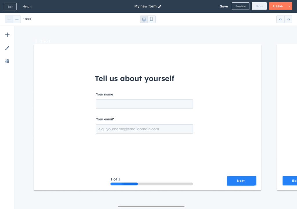
A New Editor
A brand new editing experience, where the canvas is the main focus. Giving users a clean, spacious area to build their forms. With multi-step capabilities to allow users to break long forms down to more, shorter steps.
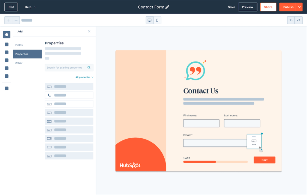
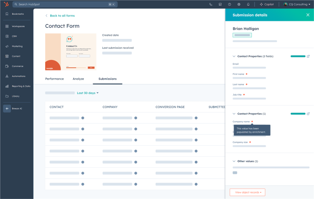
The New Property Connector
A smart (AI powered) ‘property connector experience’ that would allow us to leverage the power of the HubSpot CRM without burdening users with extra friction when it came to using Properties. (In HubSpot, properties are effectively data stored on the CRM, this data can be ingested through a Form, for example, where a form field is tied or connected to a corresponding CRM property). The property connector would detect when a customer was inadvertently about to create a duplicate property for a form field that already existed in their CRM, and allow them to swap in the one they’ve created previously. This was vital to reduce the time it takes customers to create forms, but also to prevent them from creating duplicate properties in their CRM, thus cluttering their data.


Advanced Conditional Logic
HubSpot forms always had some version of conditional logic. But it was implemented in a way that didn’t really match customers mental models. It didn’t work like our competitors did. Advanced logic was arguably one of the biggest and most complex features I designed as part of this project.
We released a logic builder that allowed customers to start simple but scale up the complexity as needed. We even supported nested logic (logic inception!) and the ability to skip form steps (think SurveyMonkey or TypeForm).


Advanced Styling and Brand New UI
One of the biggest pieces of feedback we heard from customers was how limited our styling capabilities were. We expanded the scope of styling hugely, added ‘AI Styling’ where users can describe how they want their form to look and also incorporated users ‘Brand Kit’ styling by default so forms are already styled to match their branding out of the box.
One of the other features I was keen to bring to the new form builder was a raft of new UI, including buttons, input fields, dropdowns and more. All of these new UI elements had been carefully thought through, with micro-interactions and animations to provide delight and create a satisfying, tactile feeling to filling in a form. The form would also be more responsive and communicate it’s status as the user is completing it (error messages, success, validation etc).

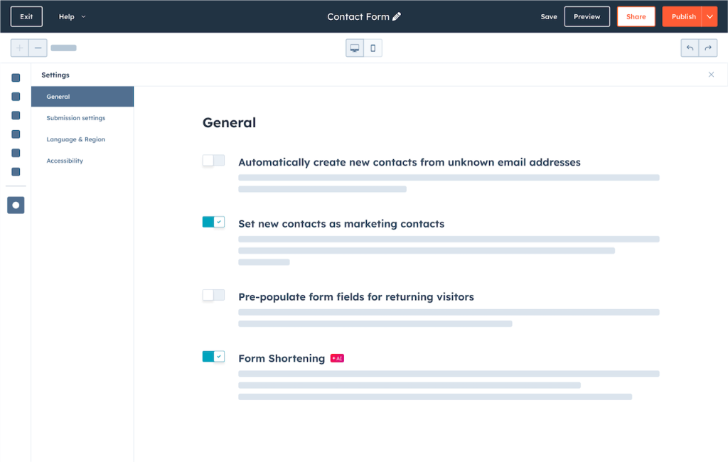
Form Shortening (AI Powerd Form Autocomplete)
One of our big showcase features was how we could leverage data from our CRM and other sources to populate form fields based on the website visitors email address. Let’s say you created a form that was 6 pages long. You asked a bunch of questions about the person filling in the form, like the company they work for, their occupation, how many employees they had, etc. Our ‘Form Shortening’ AI would look at the customers email address, check the domain name, look up our records for the latest information about that company and populate the form. This significantly speeds up the form filling process, leading to better completion and conversion rates.
And a bunch of other features:
- Modernised Data Privacy and Consent features
- Advanced automation and workflows
- Multi-market forms (auto-translation depending on the country/visitor)
- Updated security and reCaptcha
- Improved speed of rendering/loading forms
- Improved accessibility of forms with screen readers / for audio impaired
- Embedding forms in HubSpot CTAs (Pop-ups)
- and much more!
Release / Launch at INBOUND ’24 / Measuring Success
Private Beta
We first launched to private beta with a subset of features available. UX continued to design for the upcoming feature milestones while supporting the team, and analysing feedback coming in from the beta cohort. We set up a slack channel to ping us anytime a new form was created, including a link to the form so that we could see how customers were using the new features. We could also see any workarounds they might be using that we could in turn use as a proxy to reprioritise future milestones.
After Private Beta, we moved to Public Beta, continued to develop the product, layer more complex features and monitor feedback before launching to ‘GA’ (general availability).
Inbound 2024
Given the priority of this work, we were fortunate to have our new Forms experience shown during the INBOUND main keynote with the CPO. We were inundated with requests from users who wanted to try out the new Forms experience.
Success metrics
The new Forms tool launched fully to GA after INBOUND 2024 and we collected data on usage, conversion rate, CSAT, publish rate and user feedback through an in-app survey.
- Form conversion rate for Editor 1.0 Forms was 4.51%, while Editor 2.0 Forms were at 7.65%. :green
- Conversion rate for Editor 1.0 Forms was 2.6%, while Editor 2.0 Forms were 12.12%, indicating a 4x conversion boost
- CSAT 83% vs. 65.4% for the legacy editor
- Usage:
- 98% of users use the new styling features
- 74.1% of users use the new multi-step feature
- 13.9% use advanced conditional logic
- Publish rates higher across the board
Customer quotes:
- “Extremely easy to navigate and build a form vs. the legacy editor” – Name withheld
- “OBSESSED YOU HAVE CHANGED MY LIFE – AND IF I HAD CHILDREN I WOULD NAME THEM AFTER ALL OF YOU BUILDERS OF THIS MAGICAL TOOL. MY HATRED FOR THE OLD FORMS JALOPY KNOWS NO BOUNDS… BUT THIS IS A BRINGER OF JOY. BLESSINGS UPON THE WIZARDS WHO BUILT THIS. IN A FEW YEARS IT WON’T MATTER AS AI WILL HAVE TAKEN OVER ENTIRELY – LIKELY – BUT UNTIL THEN THIS MAKES ME LOOK LIKE THE GENIUS THAT I AM NOT.” – R. Nielson
- “I’ve professed my love of the new forms tool before, so I won’t gush again… but FANGIRL HERE” – Rulonna N.
- “Even the part where I had to create new properties went smoothly and I love the way the form turned out.” – Robert McC.
- “Very pleased with it – I’m still a beginner at this, but it is easy to work with” – Deborah S.
- “Hi, I’m a Hubspot partner, just rolling this out to client’s portals. I.m.o. this is the best upgrade you’ve ever added to Hubspot.” – Trudy B.
- “LOVE IT – EASY TO USE AND HAS LOTS OF FEATURES” – Matt McG.
- “Oh my gosh! the forms tool is absolutely so much better than it used to be and most other platforms I’ve worked with. It’s really easy to pick up once you understand the basic layout.” – Robert B.
- “Really intuitive and prescriptive. Good job.” – HC Bothmann
- “LOVE this compared to the old version.” – Katy G.
- “user friendly, easy to learn and use, while being robust as well, great tool overall” – Dina W.
- “very happy, great to see hubspot natively does multi-step forms now” – Rob D.
- “the multi stage forms is LONGGGGGG over due and I am SOOOOO glad we can do this in HS not and not have to use Google forms. Great Improvement!!!!” – LJ Merchant.
- “The new one is much better. forms look way better now” – Anuj S.
- “I’ve just started using it, but it feels like a step up from the last form builder.” – Francois de K.
- “I love the flexibility” – Rachel S.
- “Much easier to use and design with” – Michael W.
- “Just starting but so far.. amazing.” – Itamar E.
- “Awesome, so powerful. New format took a little getting used to, but I now feel like a power user. The new tools look as great as Typeform but mesh with your best-in-class CRM :)” – Paul R.
- “This is so much smoother and intuitive to use.” – Tony T.
- “As someone who has designed forms since the good old days before computers, but no there were no dinosaurs, and HubSpot is the best package I have ever used. So much more than a CRM. I’m really looking forward to growing my HubSpot skills. By George, I think you’ve done it!” – Coachowens.com
There is some wonderful feedback in there which was very encouraging to read after we launched to the public.
Learnings
What I would change?
- Ensure every external team that has a dependancy are brought in to the fold as soon as possible to ensure there are no missed deadlines.
- UX check-ins could be long and too frequent at times. This can have a negative impact on the team. Create more time for focused work and less check-ins when things are going good.
- Over-communicate on project status updates to the wider stakeholders outside of the team, especially during the time when the team are ‘heads-down’ working. It isn’t always apparent how the team are progressing, particularly for higher up leadership who have a busy schedule.


